Fiverr is an online market place for selling goods and services starting at $5. It is in the top 200 websites in the world and is very popular. In fact, Fiverr is like the eBay of micro-tasks and goods. You can buy anything from an article, to 1,000 Twitter followers, to a hand-painted drawing. If you can imagine a service, then it’s probably being sold on Fiverr.
The idea of Fiverr is great. However, it was released in 2010 and hasn’t had a major upgrade since then. The design and functionality of the site was quickly getting old. Not to mention that the system had a lot of shortcomings and glitches.
Earlier this week the Fiverr developers announced that the newest version of Fiverr (dubbed Fiverr V2) will be coming out. They created a waiting list in which buyers and sellers could join. Since then, Fiverr users have been getting upgraded to the new Fiverr slowly. I was given access to Fiverr V2 today and figured that I could use my early access to review it. No one else seems to have reviewed V2 yet. So everything you see here is right off the press 🙂
Fiverr’s New Homepage
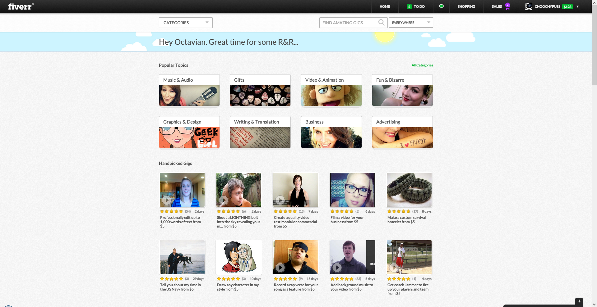
The new homepage has been completely redesigned to focus on thumbnails and rating. In the previous Fiverr design, listings showed excerpts from each gig. Now the excerpts are gone and all that’s left are ratings, thumbnails, delivery dates and titles.
There’s also a changing message in the top. If it’s past 12PM it will say “great time for lunch.” In the image above it says “Great time for some R&R” because it’s 2:34PM on a Friday.
Fiverr’s New Category Pages
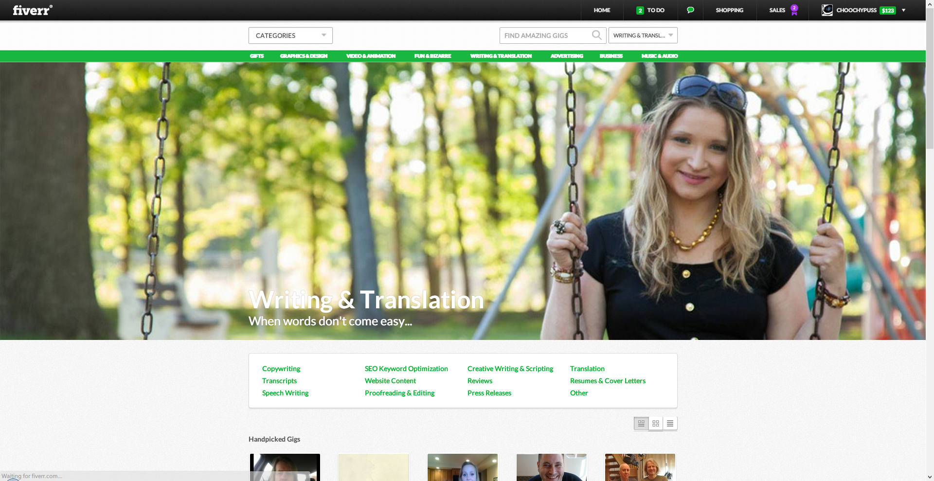
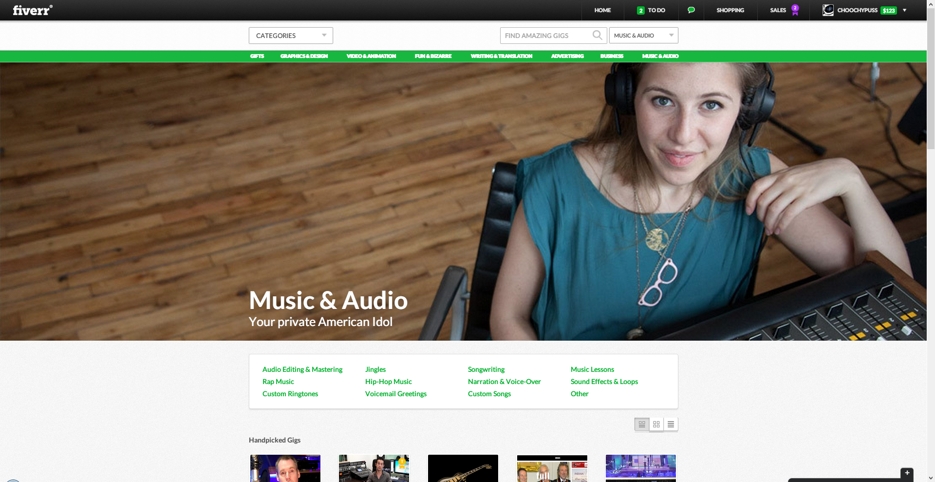
While you might think this redesign looks great. I would have to disagree. When you look at category pages such at the ones above at full-size, the banner photos will seem really pixelated. Also I’m not aware if the designers know that most of the content requires scrolling down because of the banner photo now…
You want visitors to have access to content as quickly as possible. The site would look and function a lot better if the huge banner wasn’t there. It gets really old having to scroll down after the 3rd category page you look at.
Fiverr’s New Gig Pages
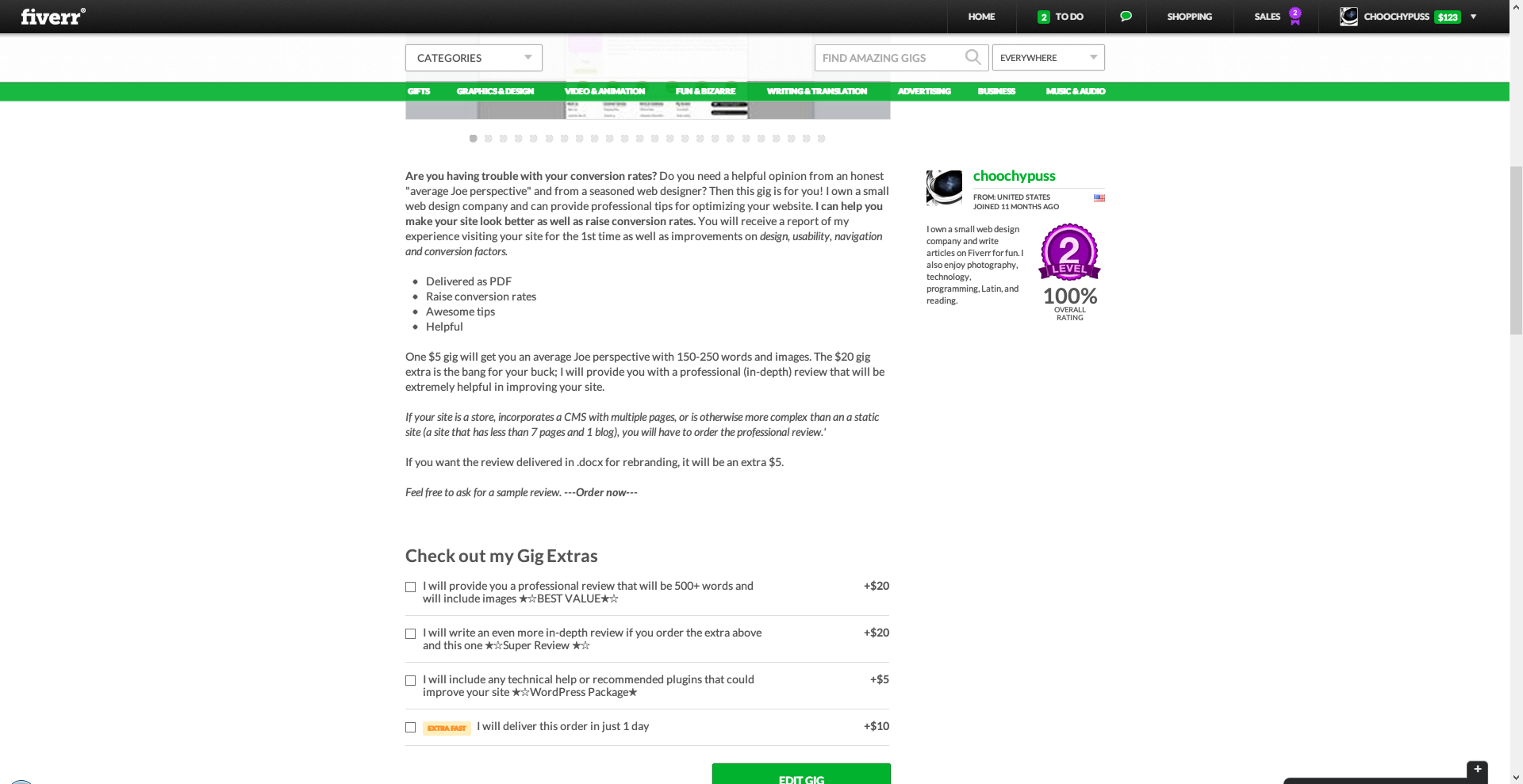
Sellers also have the option to customize the top banner image on their gigs. I chose to go with a simple photo of hills because it has the best integration with the general Fiverr design/hills motif. You’re not allowed to upload a banner that has text it in though. You’re also not allowed to advertise anything through it.
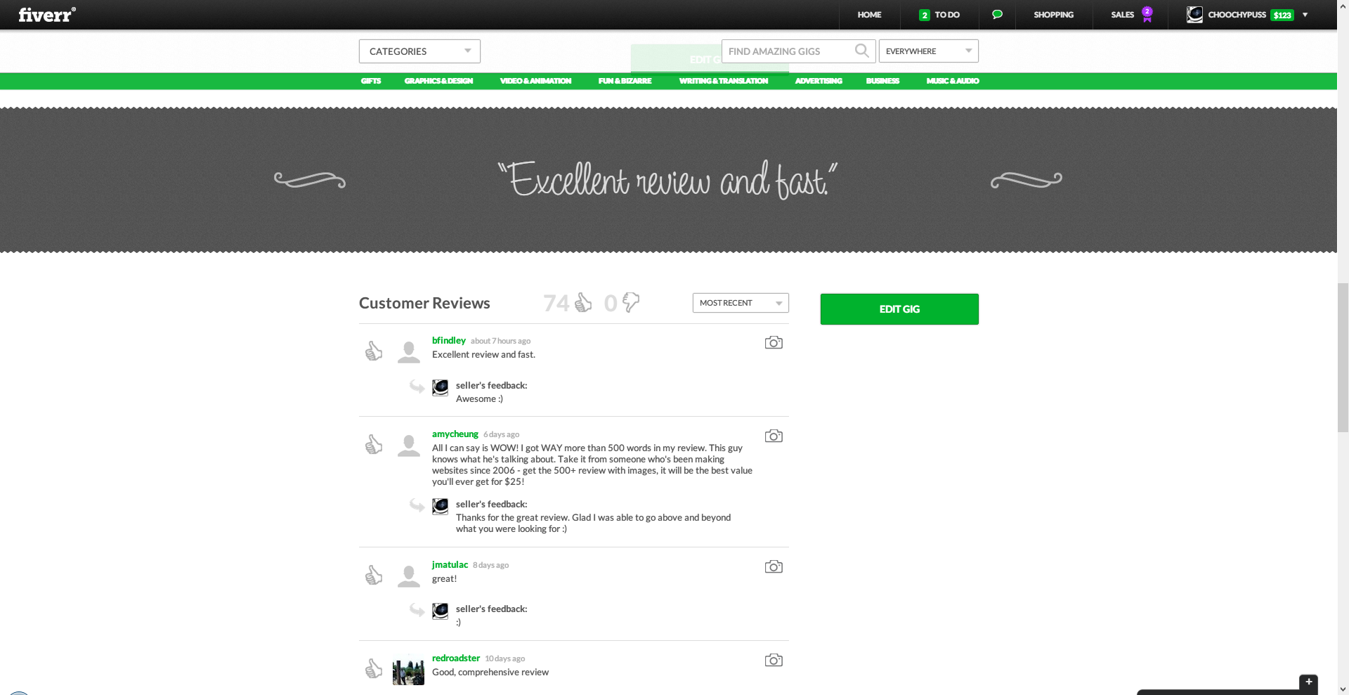
The new review area looks really great though. As does the gig description. Now buyers can also see how long sellers take to respond to messages.
Fiverr’s New Profile Pages
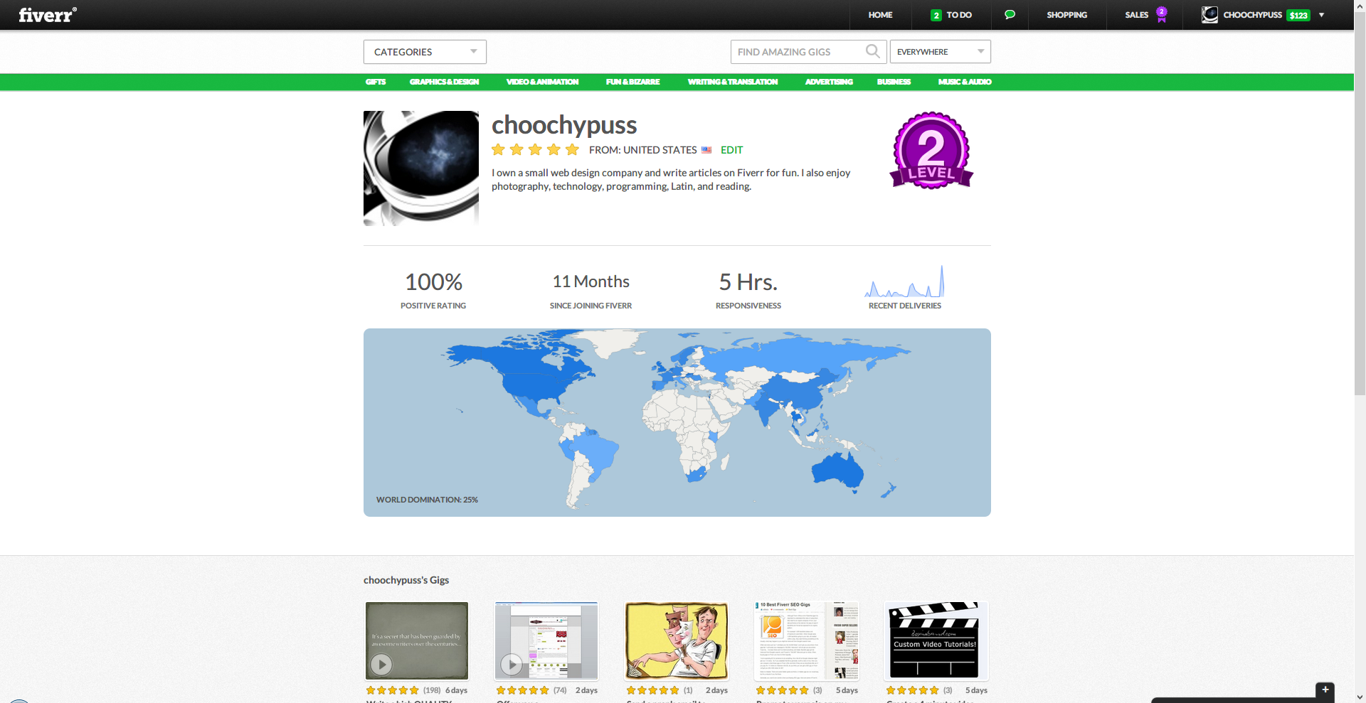
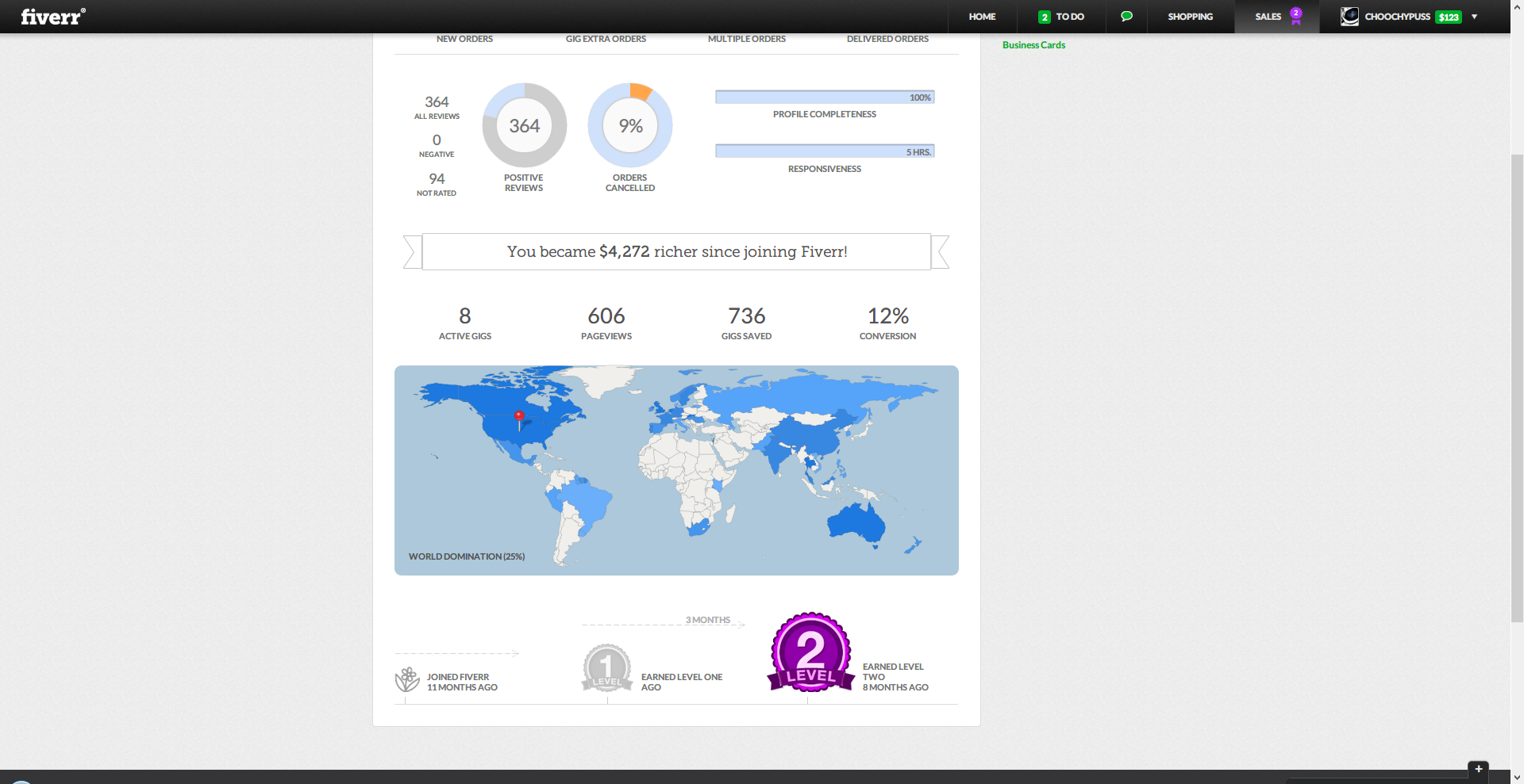
The new profile pages look really great now. They include a “recent deliveries” graph as well as a map showing how many countries you’ve sold to. My current “world domination” statistic is at 25%.
Fiverr’s New Shopping and Sales Pages
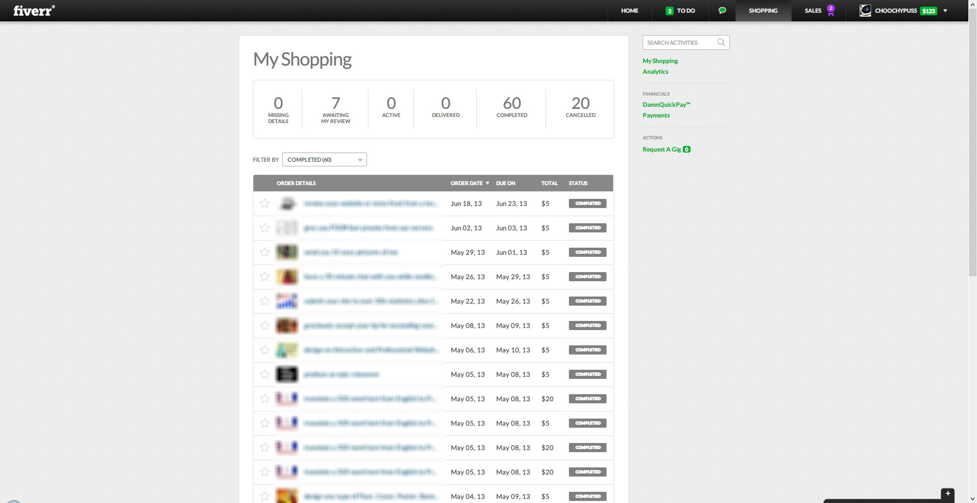
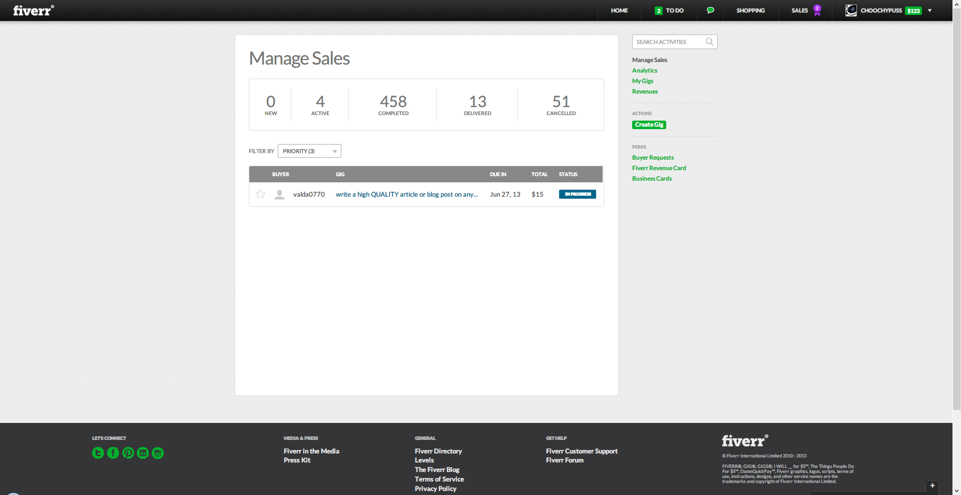
These pages have also been updated to have a clean cut look to them. Whereas the old Fiverr was plagued by blues and greens, the new Fiverr is more simplistic.
Fiverr’s New To-Do List
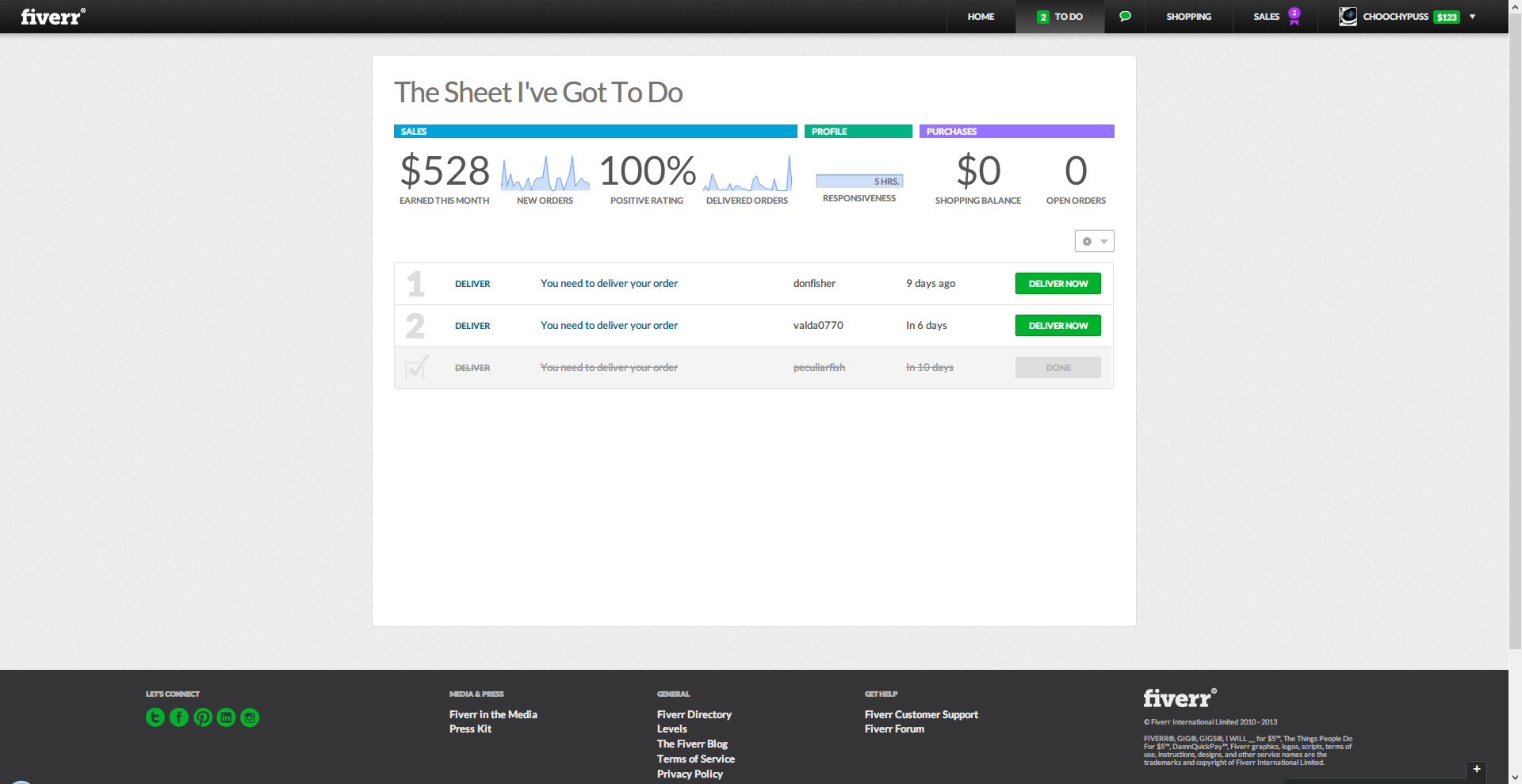
Fiverr now has a to-do list which lets you know about any orders you need to deliver or feedback you need to leave. It’s nice that they have a graph for new orders and delivered orders. However there’s no time or date on these graphs so they are pretty much useless. You don’t even know when they begin or end…
New Top Navigation Bar and Feedback Widget
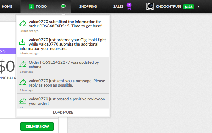
The new navigation bar is actually really great. The drop-down messages notification uses AJAX to update without having to refresh the page. However the feedback widget that is always open in the bottom right side of the site gets annoying really quickly. Even if you turn it off on one page, it opens up again another page.
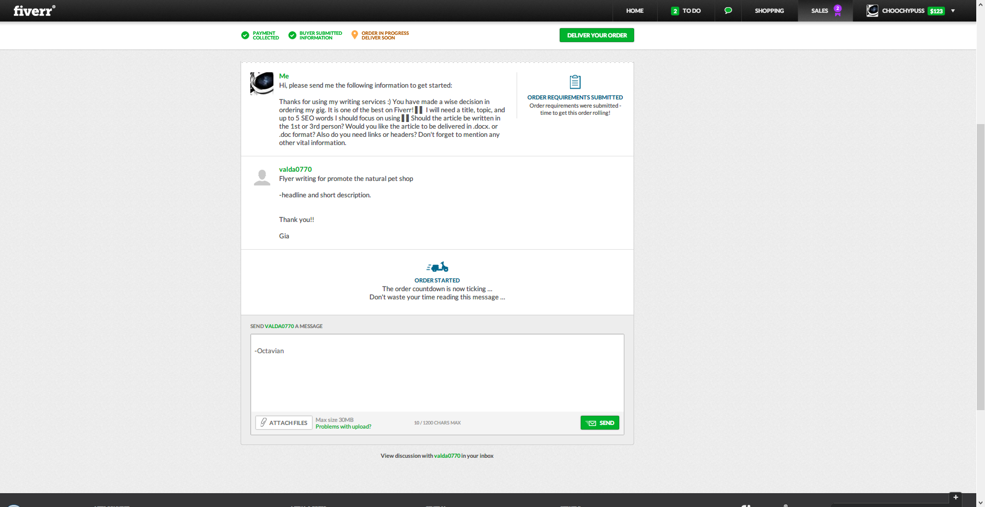
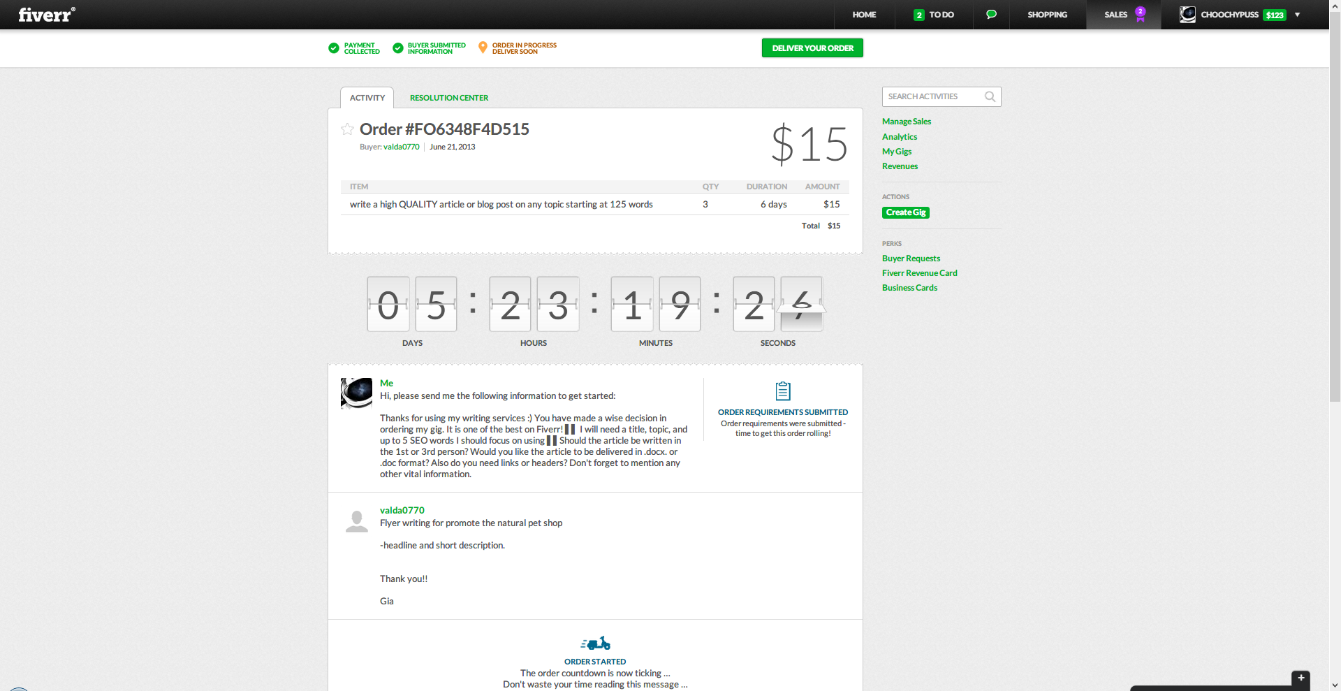
Fiverr’s New Order Page
The order page has been updated to show a count-down of how much time is left until the deadline. Also the maxium file size has been bumped up 10Mb to 30Mb instead of 20.
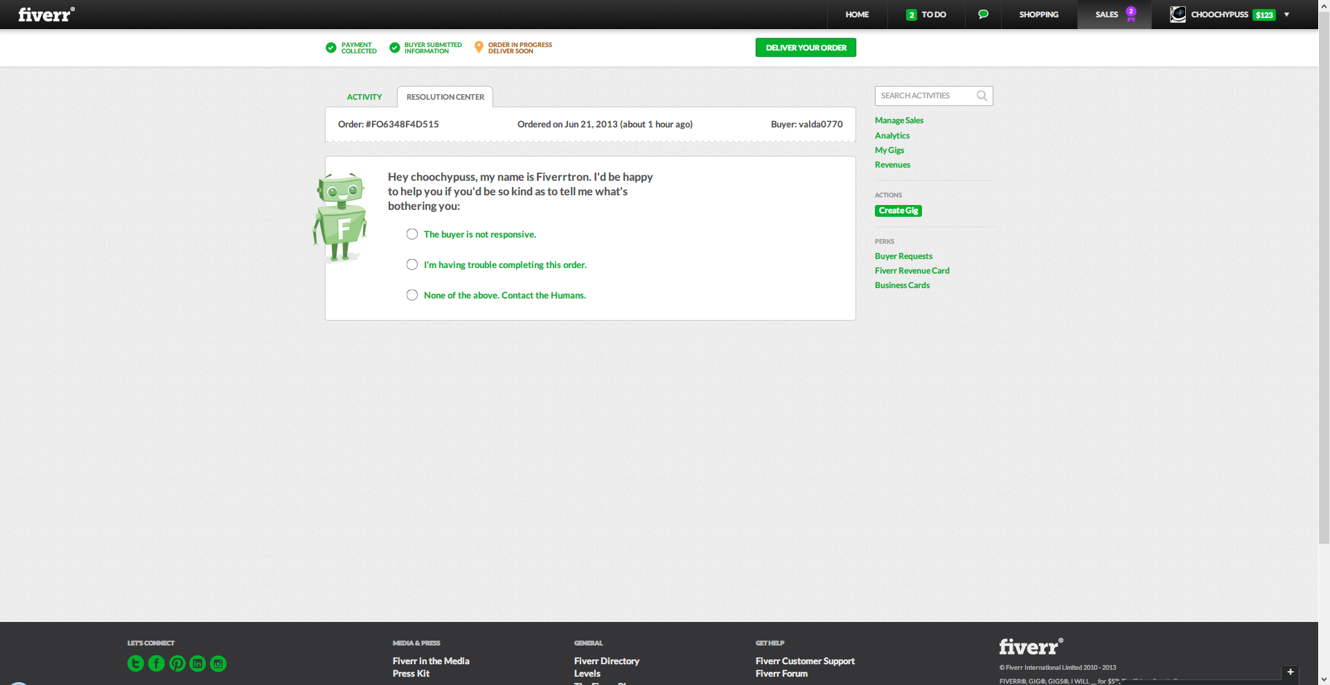
There’s also a new resolution center with three options:
- The buyer is not responsive.
- I’m having trouble completing this order.
- None of the above. Contact the Humans.
Fiverr’s New Conversation Page
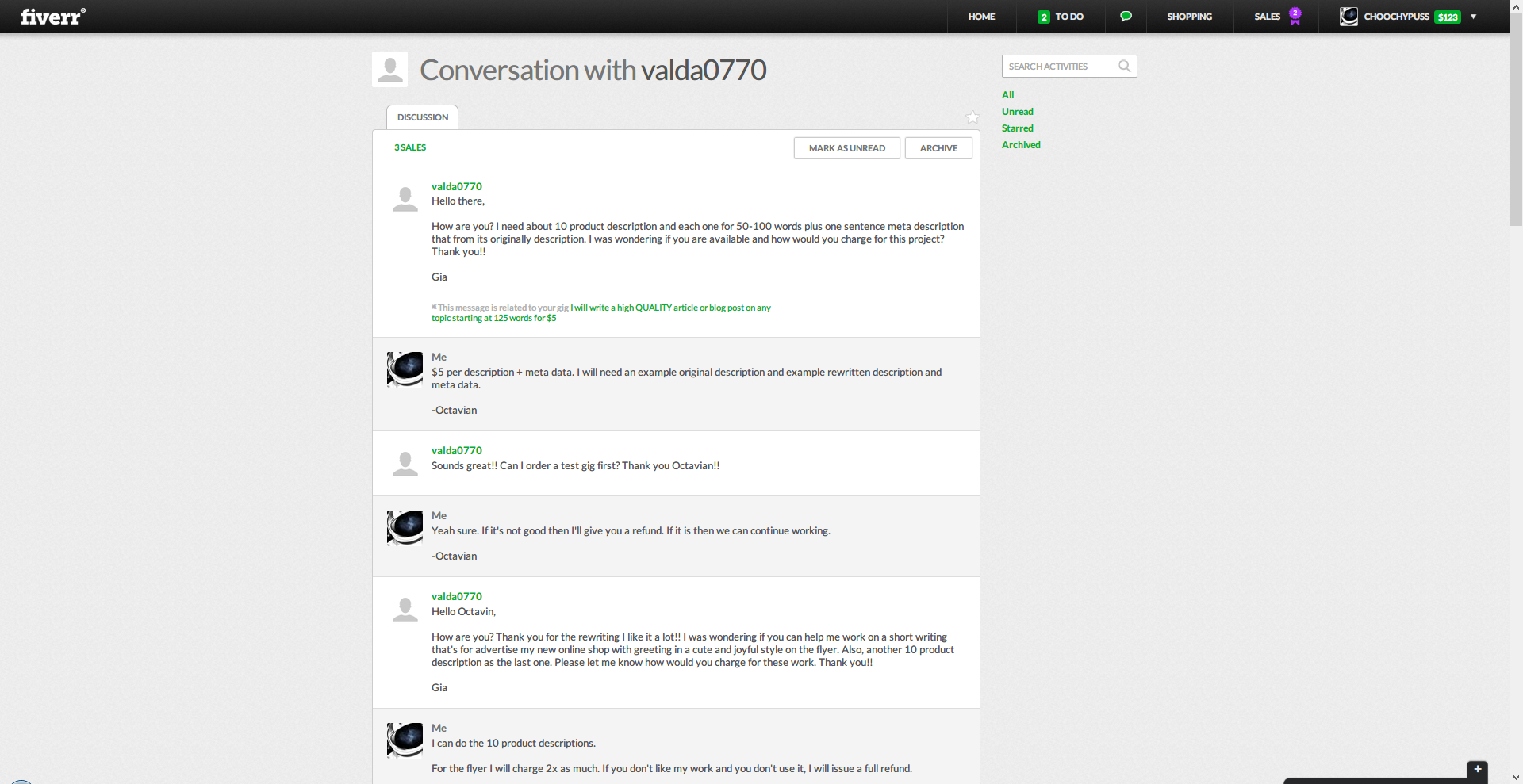
There’s not much to say here… The conversation page has been updated to look simpler/better. It’s definitely an improvement over Fiverr’s old conversation design with blue/green boxes for seller vs buyer.
Fiverr’s New Revenues Page
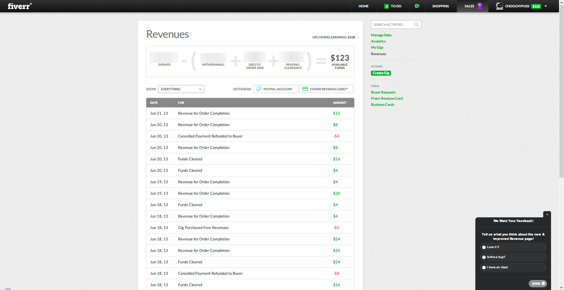
The new revenues page now shows how much funds you earned, total withdrawals, funds spent on gigs, pending clearance and available funds. It does this through a cool equation that shows up if you hover over the revenues page.
Fiverr’s New Sales Analytics Page
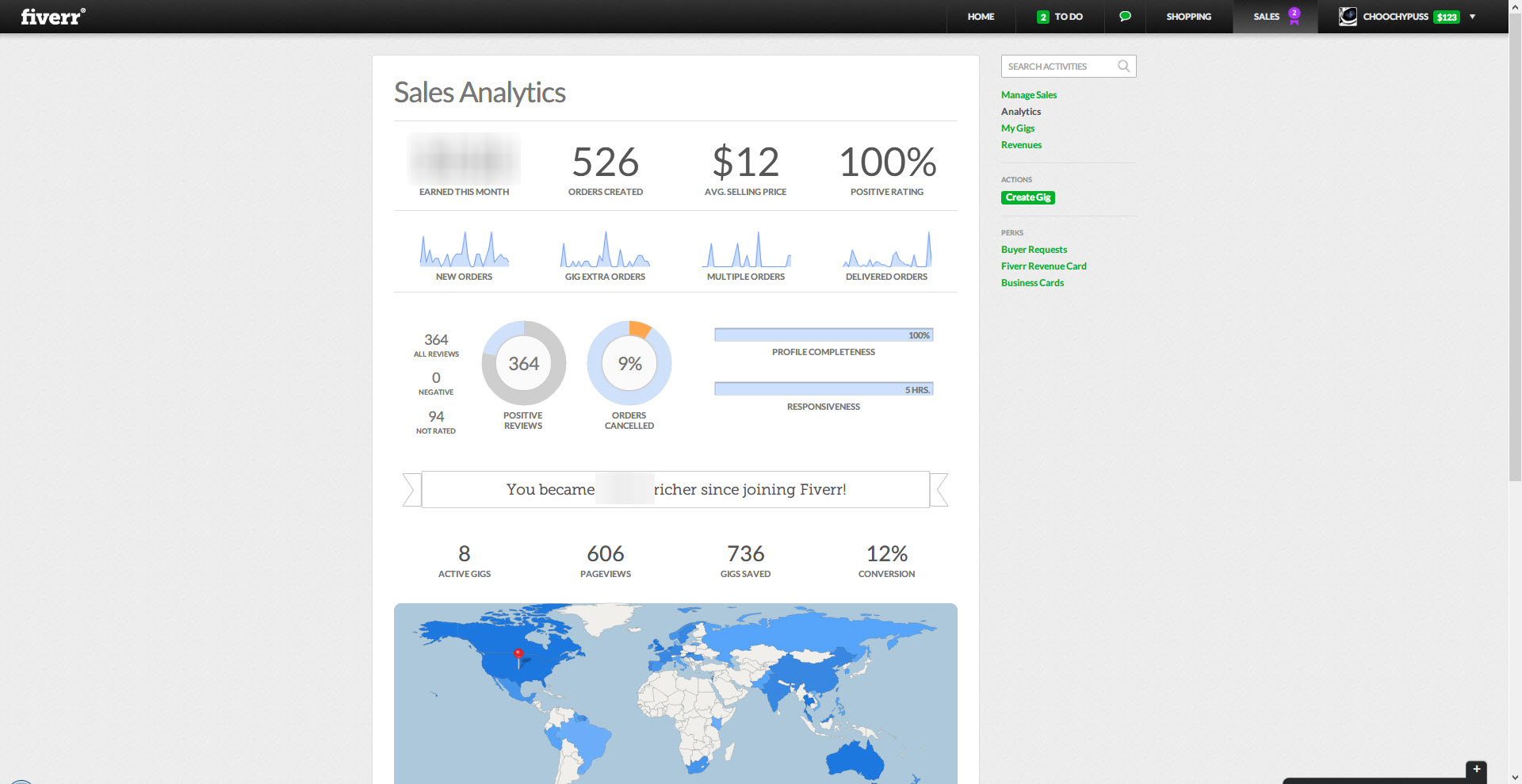
The analytics feature is something that I think was directly influenced by me. I contacted the CEO of Fiverr directly questioning why we don’t have analytics and I also wrote about how I measure my own conversion rate. Not to mention that I even posted a poll on Fiverr asking people if they wanted an analytics feature to come to Fiverr:
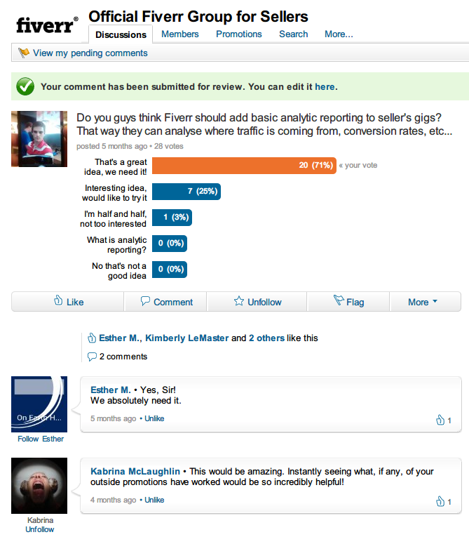
However the current analytics page that V2 has sucks. It sucks big time… The graphs are useless and don’t have dates on them. You also can’t go a month back in time to look at your analytics. Not to mention that there’s no feature that lets you see where visitors comet to your gigs from.
Fiverr’s New Gig Management Page 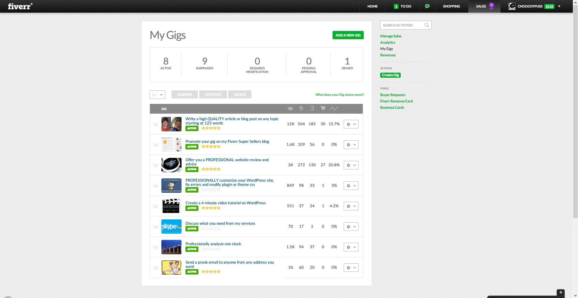
The new Fiverr design incorporates interesting data about your gigs such as: conversion rates, impressions per month, page views and sales. This is useful for sellers to be able to pinpoint which gigs they need to improve/focus on.
Conclusion
The new Fiverr design is great (except for the huge low-quality image banners that plague 90% of the site), However the analytics feature lacks a lot of functionality. Not to mention that sellers and buyers still can’t communicate through a live chatting system.
The idea here is that Fiverr finally updated their site. But it’s not good enough. At the end of the day, all they really did was change the appearance of the site. Nothing less, nothing more.
Fiverr was the first micro job website.. They were the first
and only one, but now SEOClerks has pushed them down to second place!
SEOClerks is amazing. They have money giveaways, competitions and they
have a splendid support. You can’t find a better Fiverr alternative and
if you do, just tell Jordan about it (SEOClerks owner) and he’ll make
SEOClerks even better! (That’s how good they are!)